
Case study · 05 · Clinic marketing site

Precision, refined — a luxury aesthetics clinic with nothing to prove.

Start something like this
Scroll-driven 3DEditorial layoutBefore-and-after compareEnquiry capture
The full pageHero to closing in ten stops: the treatment menu, the device render, the platforms diagram, the protocol and the enquiry form.

The short version

A clinic site that sells restraint, built around one scroll-driven centrepiece.

01

The problem

Aesthetics sites all look alike: stock smiles, pastel gradients, a price list. None of them read as expensive.

02

What I built

A dark editorial site with a scroll-driven device render, a tabbed treatment menu and a before-and-after compare.

03

Why it works

The design withholds. Restraint is what this kind of clinic sells, so the site has to sell it first.

Asad Khan pointing at the summary of the project

0

Sections, hero to enquiry

0

Treatment categories, one panel each

0°

Of scroll-linked rotation on the render

0

Before-and-after categories

Vanta is a concept site for a high-end aesthetics clinic, built to look like somewhere expensive rather than somewhere eager. Eleven sections move from a full-bleed opening through a tabbed treatment menu, a device render that turns as you scroll, a before-and-after compare and an enquiry form that asks what someone is interested in before it asks anything else.

A self-initiated concept build. The clinic, the practitioner and every photograph are fictional, and the device render and results are labelled illustrative throughout the site.

Read the full story

The challenge

Open five aesthetics clinic sites and you will see the same one: a smiling stock portrait, a soft gradient, a grid of treatment cards and a price list. They all signal the same thing, which is that the clinic wants your booking. None of them signal that the clinic is worth the money.

The brief I set myself was to build the opposite. A site that holds back — dark, quiet, mostly empty — and lets a small number of deliberate moments do the persuading. If restraint is what the clinic is selling in the treatment room, the site has to demonstrate it first.

The approach

The page is built as a sequence of full-height sections, each with a single idea. Black stone and bone type carry most of it; gold appears perhaps four times in the whole document, which is what makes it mean anything when it does. Treatments live in a vertical tab menu rather than a card grid, so the visitor reads one at a time instead of scanning a price list.

The centrepiece is a device render that rotates through a full turn as you scroll past it, with four callouts annotating the hardware as it comes round. It is the one piece of spectacle on the site, and it earns its place by explaining something — the technology section is where a clinic usually hand-waves, and here it is the part that holds you longest.

What's inside


Every section is doing one job, and the page is arranged so each one lands on its own screen rather than competing for attention.

01 · The opening

A first screen that withholds

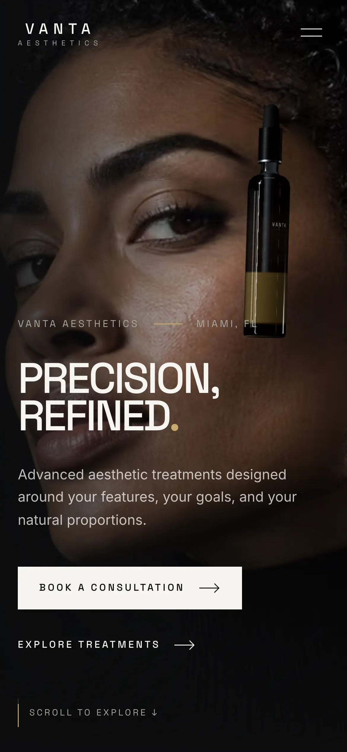
Full-bleed portrait, two words of type and a single gold full stop. No value proposition, no badges, no scrolling marquee of logos. The only instruction on the screen is to keep going.

  • Type set large enough to be the whole composition
  • One accent colour, used once
  • Location and coordinates as quiet editorial furniture
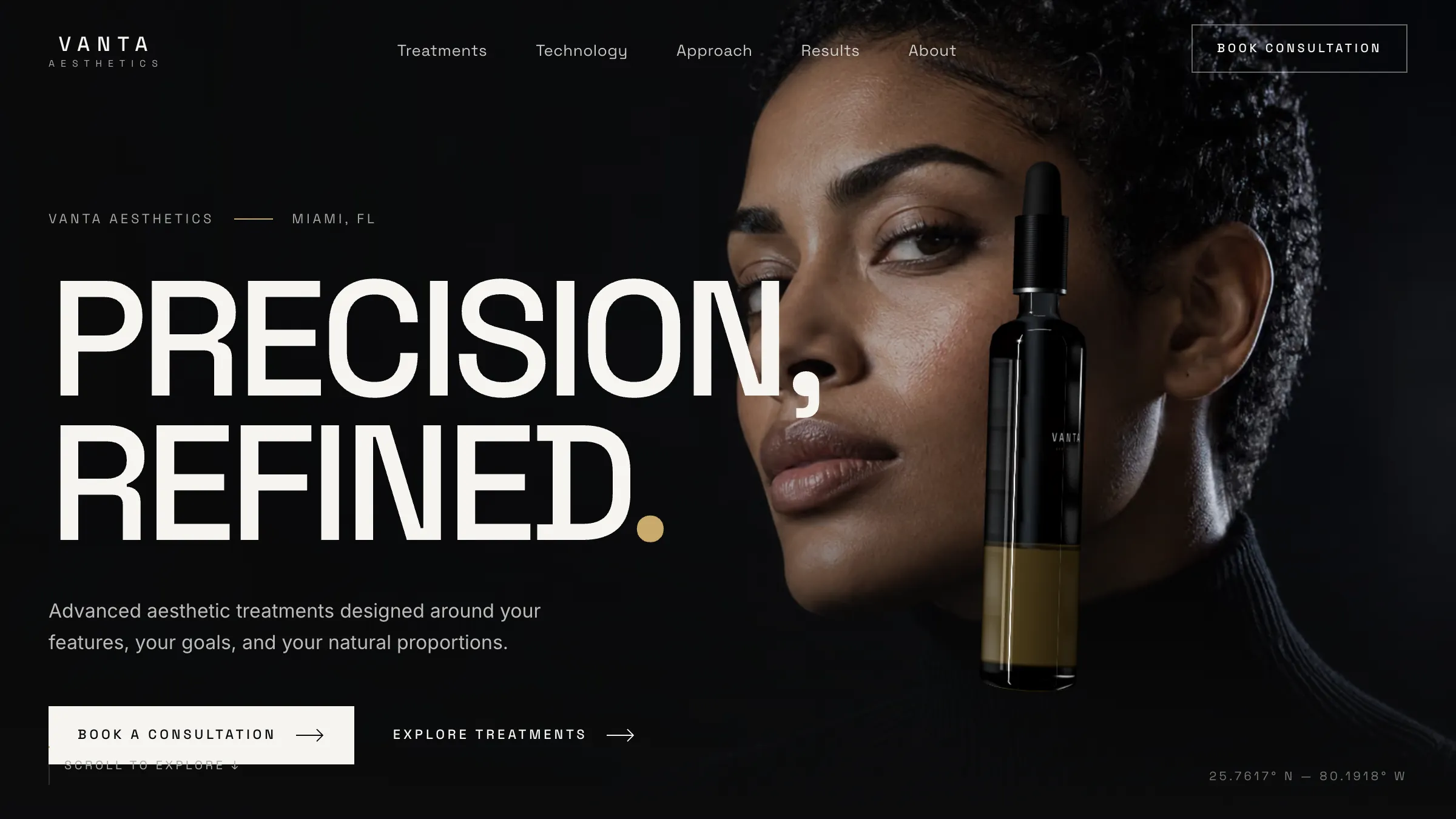
The Vanta hero: Precision, Refined. over a full-bleed portrait

02 · The treatment menu

One treatment at a time, not a price grid

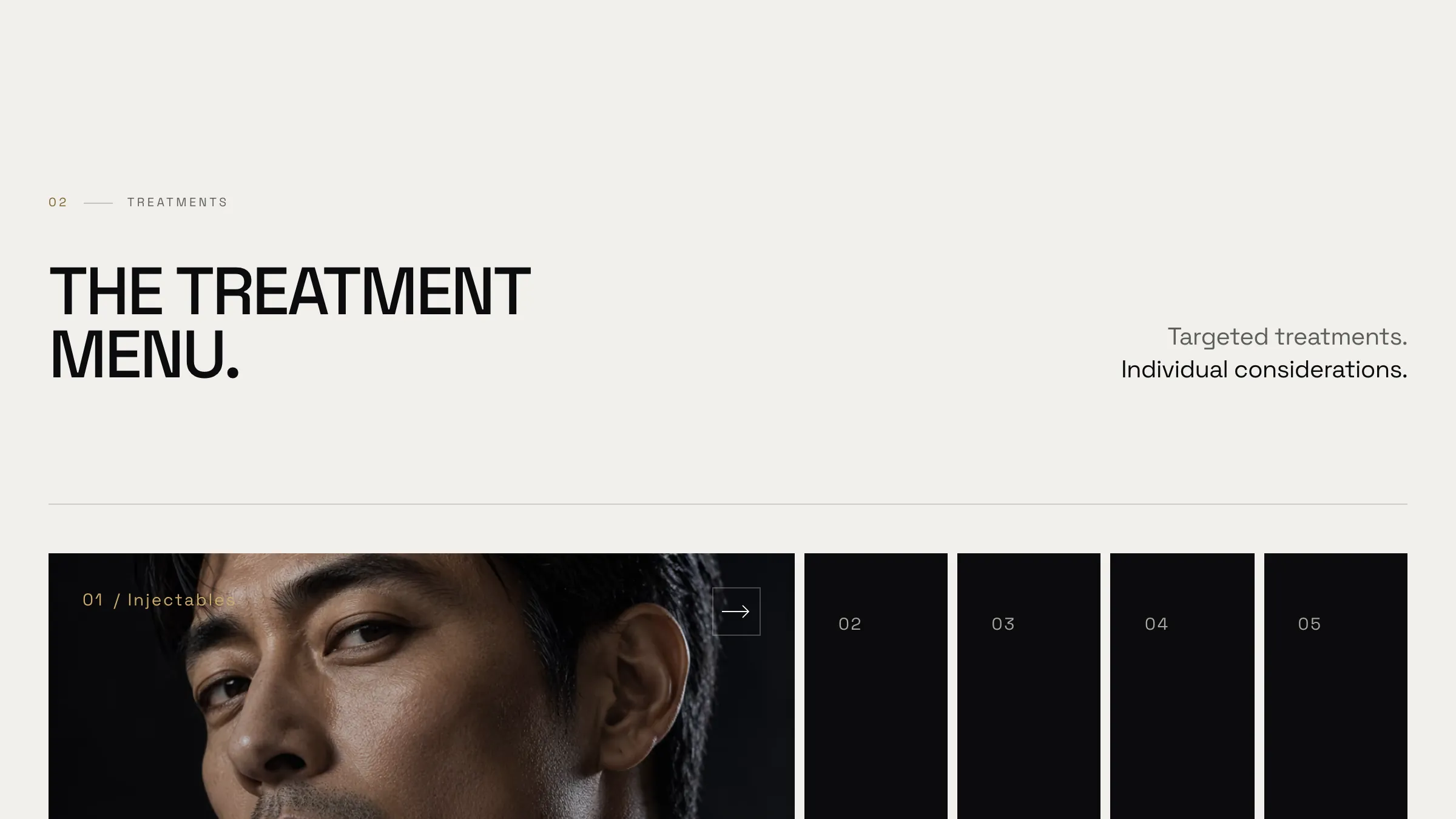
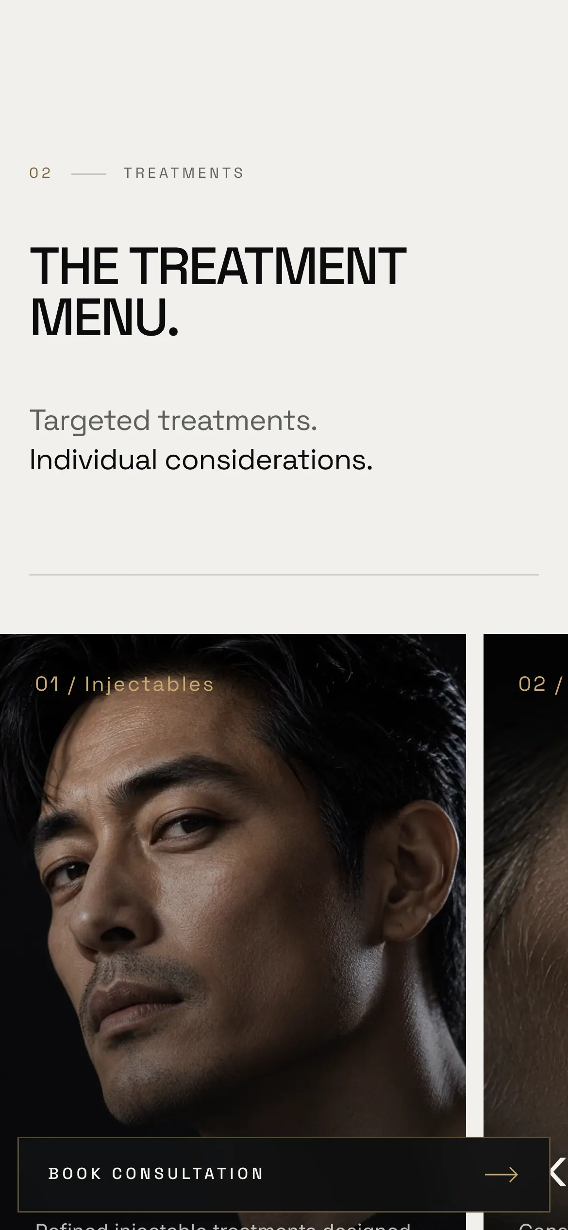
Five categories sit as collapsed vertical panels. Opening one expands it to fill the frame with its own photograph and copy while the others compress to spines, so the visitor reads rather than scans.

  • Injectables, skin, laser, body and wellness
  • Vertical spines keep the whole menu visible at once
  • Each panel carries its own consultation prompt
The treatment menu with Injectables open and the other four categories collapsed to spines

03 · The device

A render that turns as you read

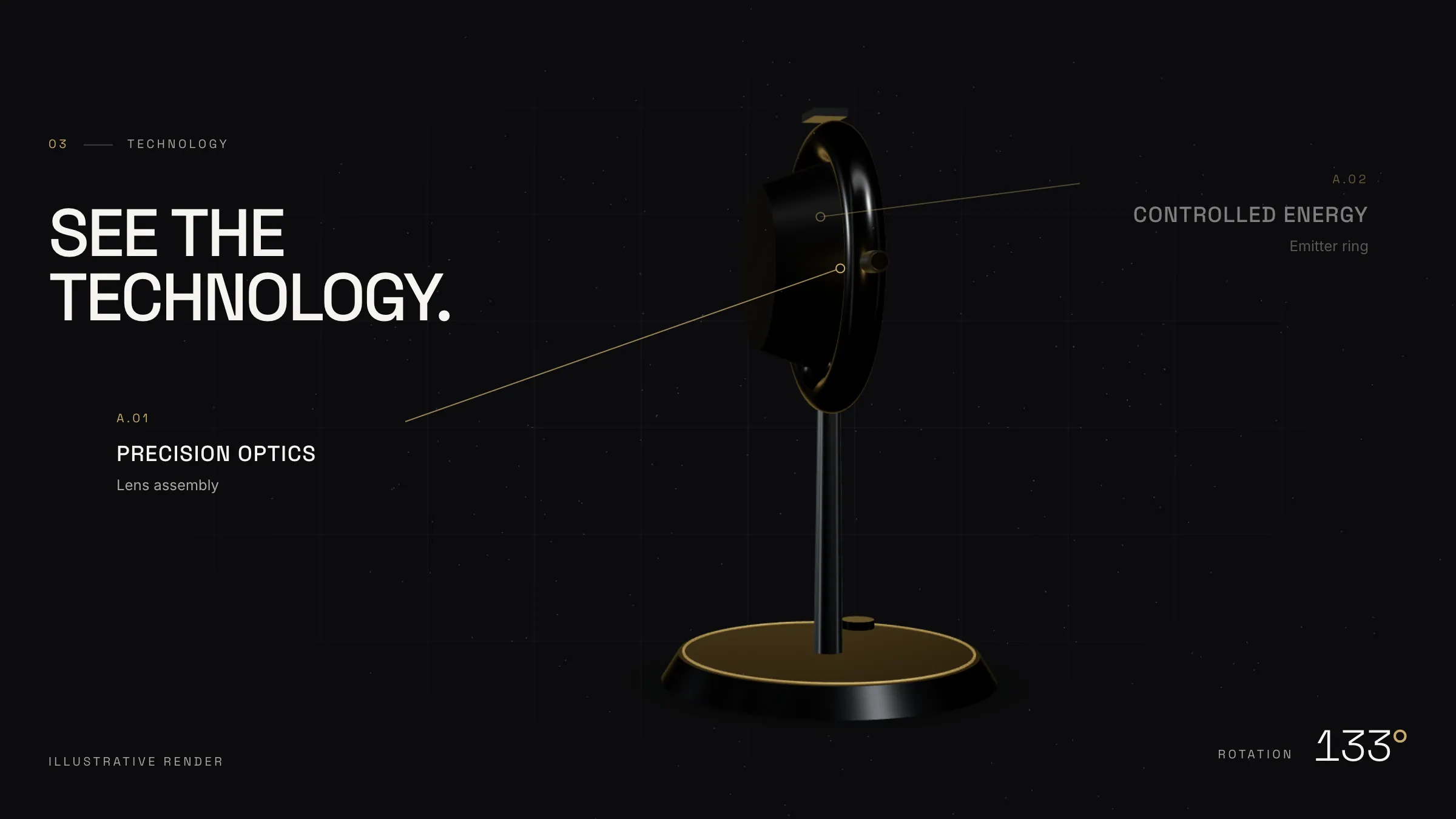
The technology section pins while a device render rotates through a full turn, driven entirely by scroll position. Four callouts annotate the optics, the emitter ring, the control base and the sensor array as each comes into view.

  • Rotation tied to scroll, with a live degree readout
  • Four hardware callouts timed to the turn
  • Labelled an illustrative render, not a product claim
The device render part-way through its rotation with the controlled-energy callout showing

04 · Platforms

The part most clinics hand-wave

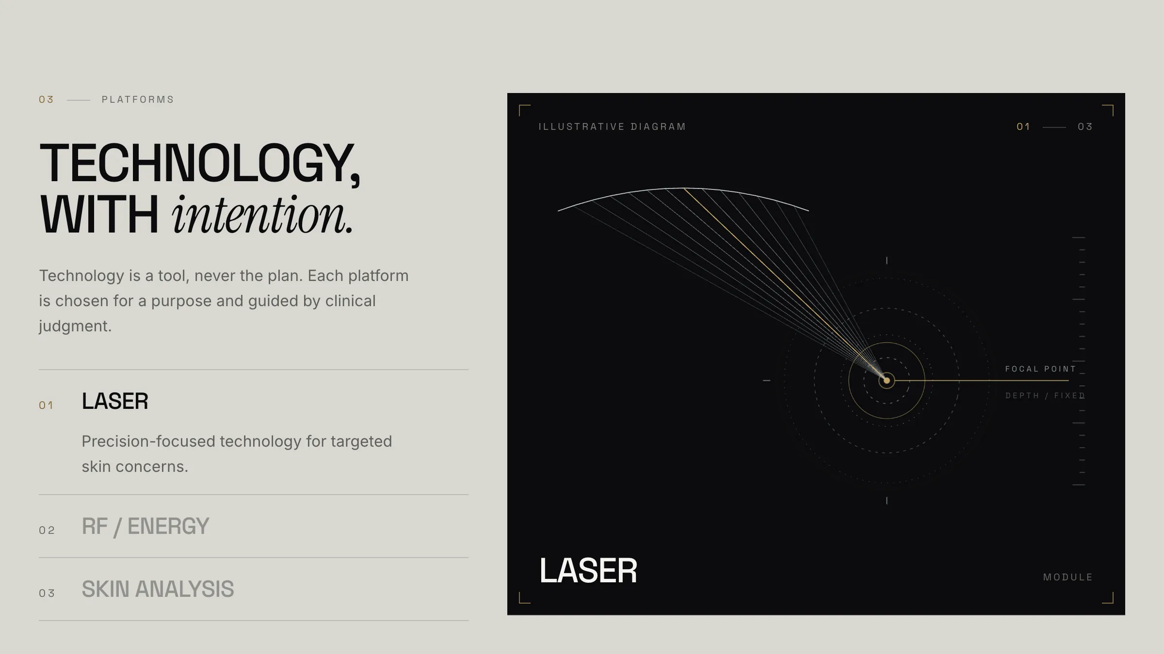
Laser, RF and skin analysis each get a plain-language explanation beside an animated diagram showing focal point, depth and region of interest. It is the section that answers what the machine actually does.

  • Three platforms, selectable from a list
  • Diagram redraws for each platform
  • Written to be understood, not to impress
The platforms section with the laser diagram showing focal point and depth

05 · The protocol

Assess, refine, maintain

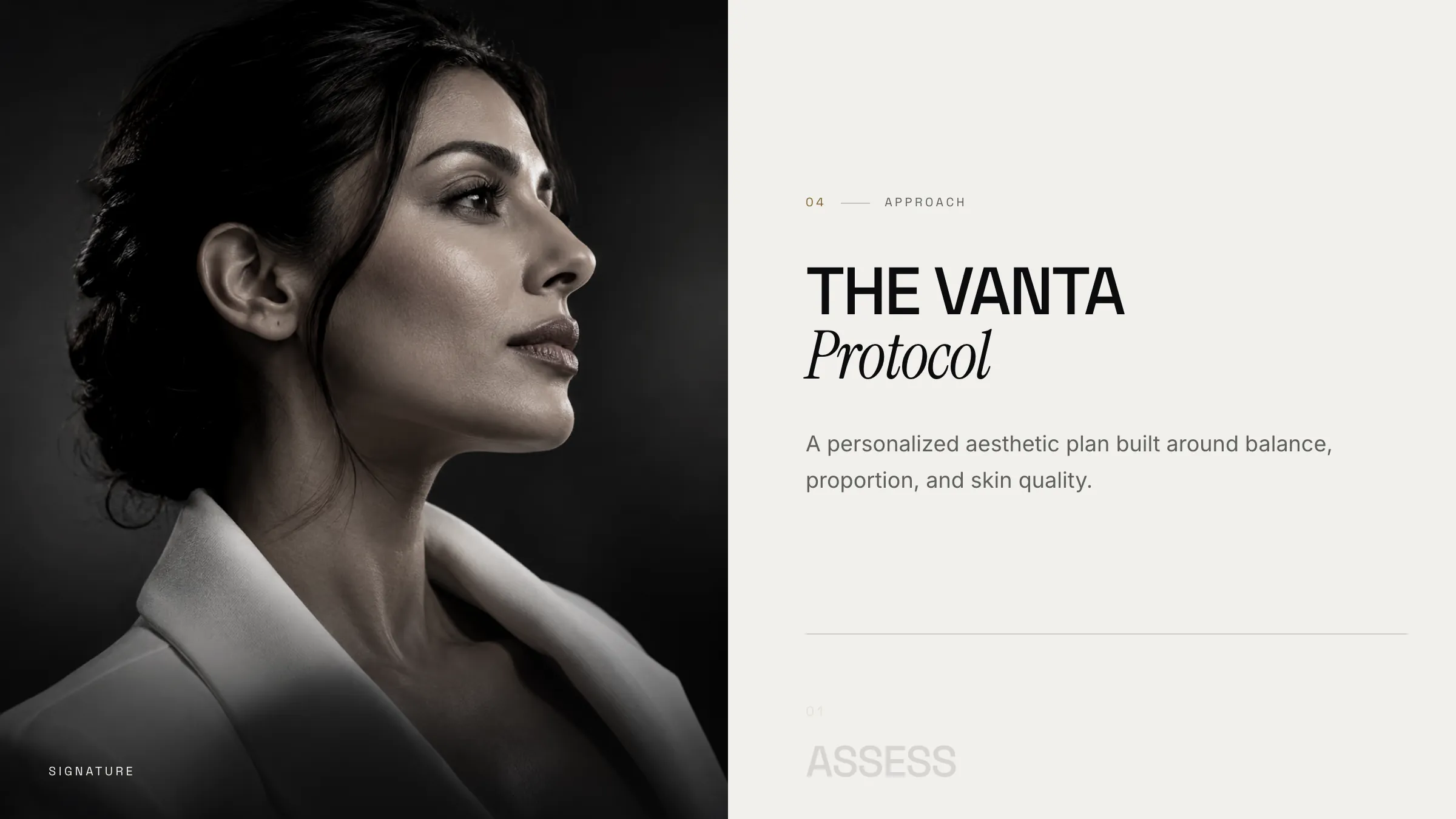
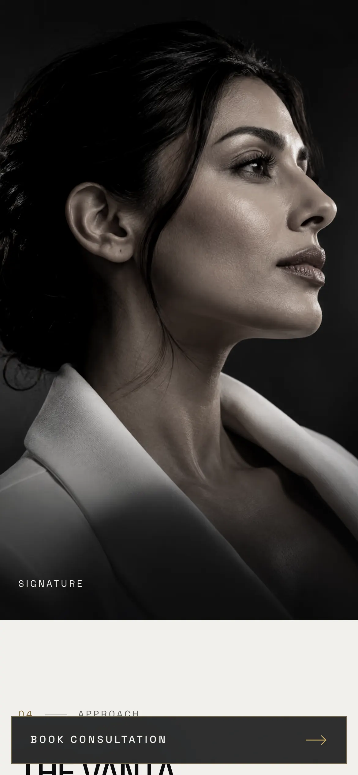
The clinic's method as three steps against a single portrait, scrolled through one at a time. It replaces the usual bullet list of promises with something that reads like a position: nothing rushed, nothing overdone.

  • Three stages, each on its own screen
  • Portrait held steady while the copy advances
  • Ends on a consultation, not a booking button
The Vanta Protocol section with the assess step and a held portrait

06 · The enquiry

Ask what they want before asking who they are

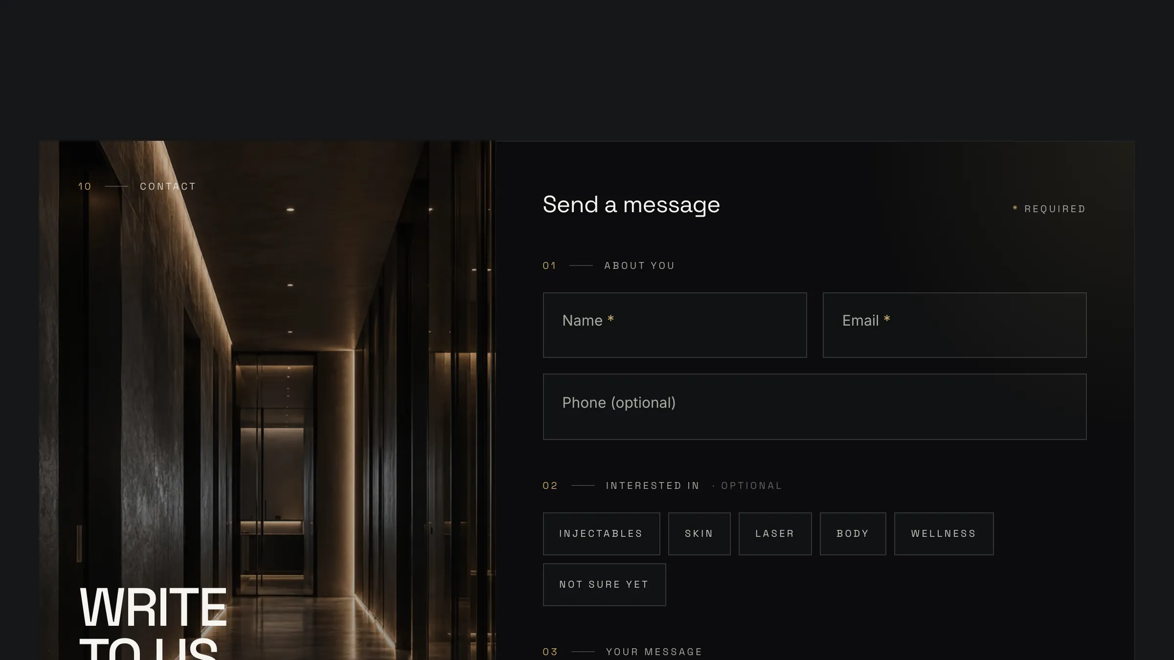
The contact form opens with the treatments someone is interested in as selectable chips — including an honest "not sure yet" — then collects name, email and an optional phone number. Three fields are required and the rest can be skipped.

  • Interest captured as chips, not a dropdown
  • A deliberate not-sure-yet option
  • Phone optional, message free-form
The enquiry form with treatment interest chips and three required fields

In motion


The full tour is playing at the top of the page; these are the parts worth slowing down for. They play on their own, one after another, or pick one from the list.

Walkthroughs01 / 02

Mobile


Most clinic traffic arrives on a phone, so the editorial layout rebuilds itself for a single column without losing the restraint that makes it work.

The hero on a phone, type stacked over the portrait
The treatment menu as stacked panels
The protocol steps in a single column
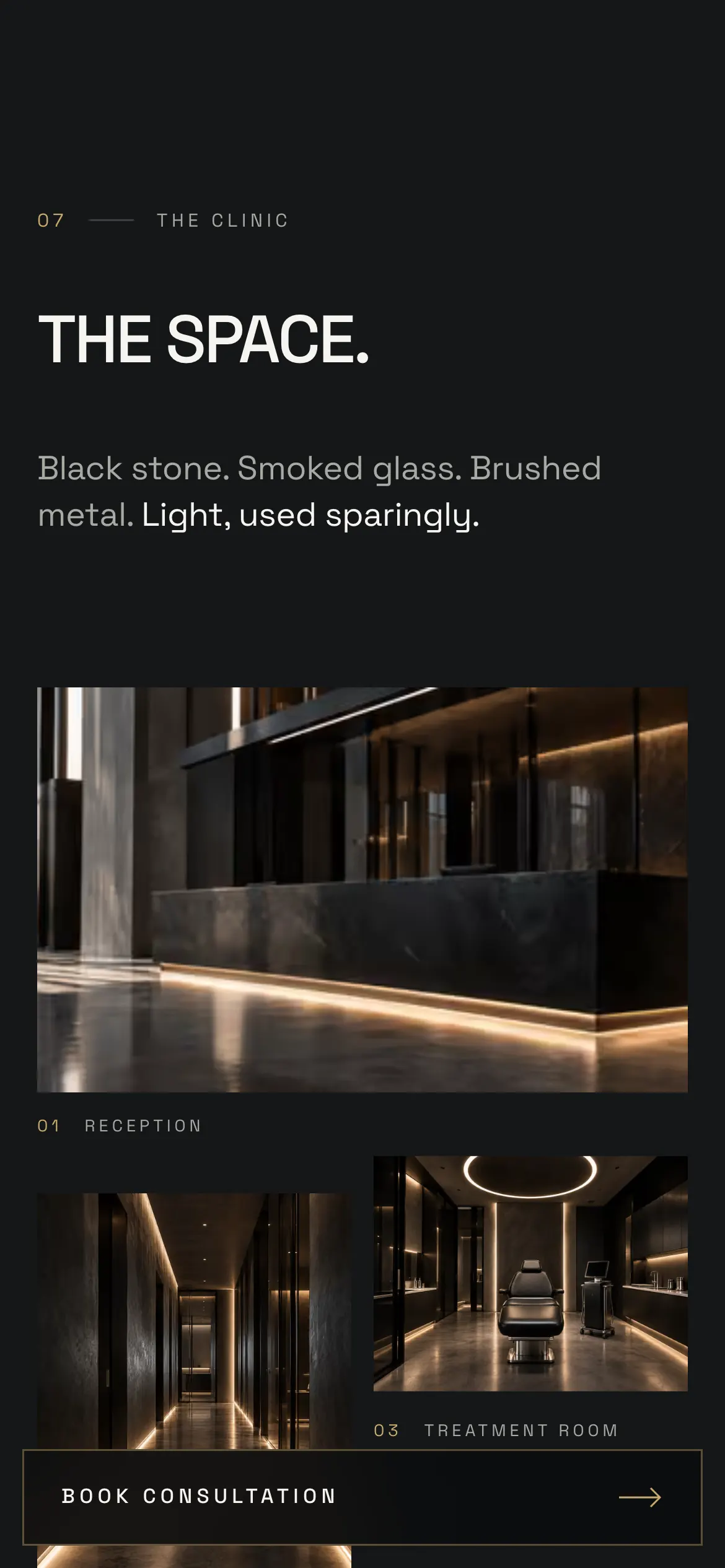
The clinic space grid on a phone
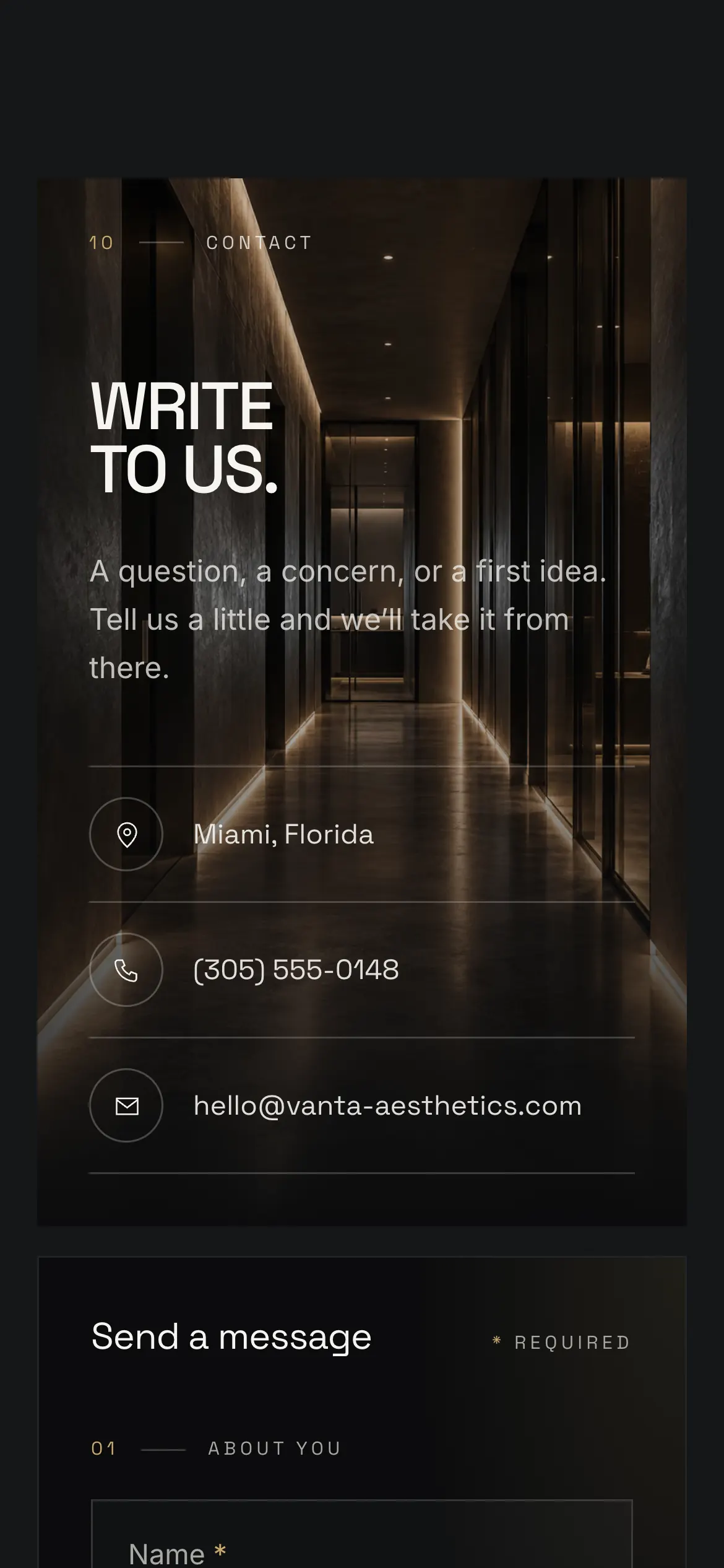
The enquiry form with interest chips wrapped to the width

How it fits together


Why a clinic site that says less ends up being more convincing.

01

Gold, four times

The accent appears on the hero full stop, the active treatment rule, the rotation readout and the primary button. Spending it anywhere else would have made it decoration instead of signal.

02

Tabs instead of cards

A card grid invites comparison shopping on price. A vertical tab menu makes the visitor open one treatment at a time and actually read it, which is the behaviour a consultation-led clinic wants.

03

The render had to explain something

A spinning object for its own sake is a gimmick. Tying the rotation to four hardware callouts turns it into the clearest section on the page, which is why it sits where a clinic usually says the least.

04

Everything illustrative is labelled

The render, the before-and-afters and the practitioner portrait all carry a visible label saying so. A clinic site that implies real patient results it does not have is a liability, and the labels cost nothing.

05

One idea per screen

Sections are sized so each lands on its own viewport. It makes the page longer than it strictly needs to be, and it is the main reason the site reads as unhurried rather than busy.

Keep exploring


A few more things I've built and shipped, picked at random each visit.

Next step

Need a site
like Vanta Aesthetics?