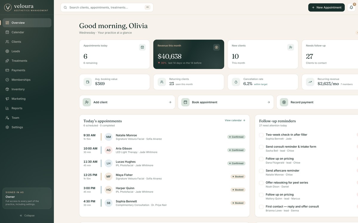

Case study · 06 · Clinic marketing site

Enhance what makes you, you — a med spa that sounds like a person.

Start something like this
Scroll-driven carouselDrag-to-compareEditorial layoutConsultation capture
The full pageHero to FAQ in ten stops: the approach, the carousel, the signature plan, the compare slider, the space and the consultation form.

The short version

The warm counterpart to Vanta: the same restraint, read as welcome rather than exclusive.

01

The problem

A med spa has to feel clinical enough to trust and warm enough to walk into. Most pick one and lose the other.

02

What I built

A light editorial site with a scroll-driven treatment carousel, a drag-to-compare slider and a consultation request form.

03

Why it works

Warm stone and serif type carry the welcome; the plain, specific copy carries the credibility.

Asad Khan pointing at the summary of the project

0

Sections, hero to FAQ

0

Treatments in the scroll-driven carousel

0

Stages in the signature plan

0

Journal articles seeded

Lumière is the warm answer to the same brief that produced Vanta. Thirteen sections move from a hero through a scroll-driven treatment carousel, a sequenced signature plan, a drag-to-compare before-and-after, a practitioner profile and a consultation request. Where Vanta withholds, Lumière explains — and says out loud when the right answer is not yet, or not at all.

A self-initiated concept build. Dr. Amelia Hart is a fictional practitioner, labelled as such on the site, and all imagery and testimonials are illustrative.

Read the full story

The challenge

A med spa sits in an awkward middle. Lean too clinical and it reads as a dermatology waiting room; lean too soft and it reads as a beauty salon that might not know what it is injecting. The site has to earn clinical trust and still feel like somewhere you would want to spend an afternoon.

Vanta answered a version of this brief by withholding. I wanted the opposite answer to the same question: what does restraint look like when it is warm? Lumière is that build — same discipline about what to leave out, completely different temperature.

The approach

The palette is warm stone, cream and a deep forest green used for the one dark panel on the page. Display type is a serif, which does most of the work of making a clinical subject feel unhurried. Nearly every section is built around a single photograph and a short paragraph, with enough air that nothing feels like it is being sold at you.

Two interactions carry the persuading. The treatment carousel is driven by vertical scroll, so six treatments pass sideways through a pinned frame as you read down the page. The before-and-after is a drag-to-compare slider rather than two images side by side, which makes the difference something the visitor discovers themselves instead of something the clinic asserts.

What's inside


Warm stone, serif display type and a lot of air, with the interactive moments placed where a visitor is deciding rather than browsing.

01 · The opening

A hero that makes a promise, not a claim

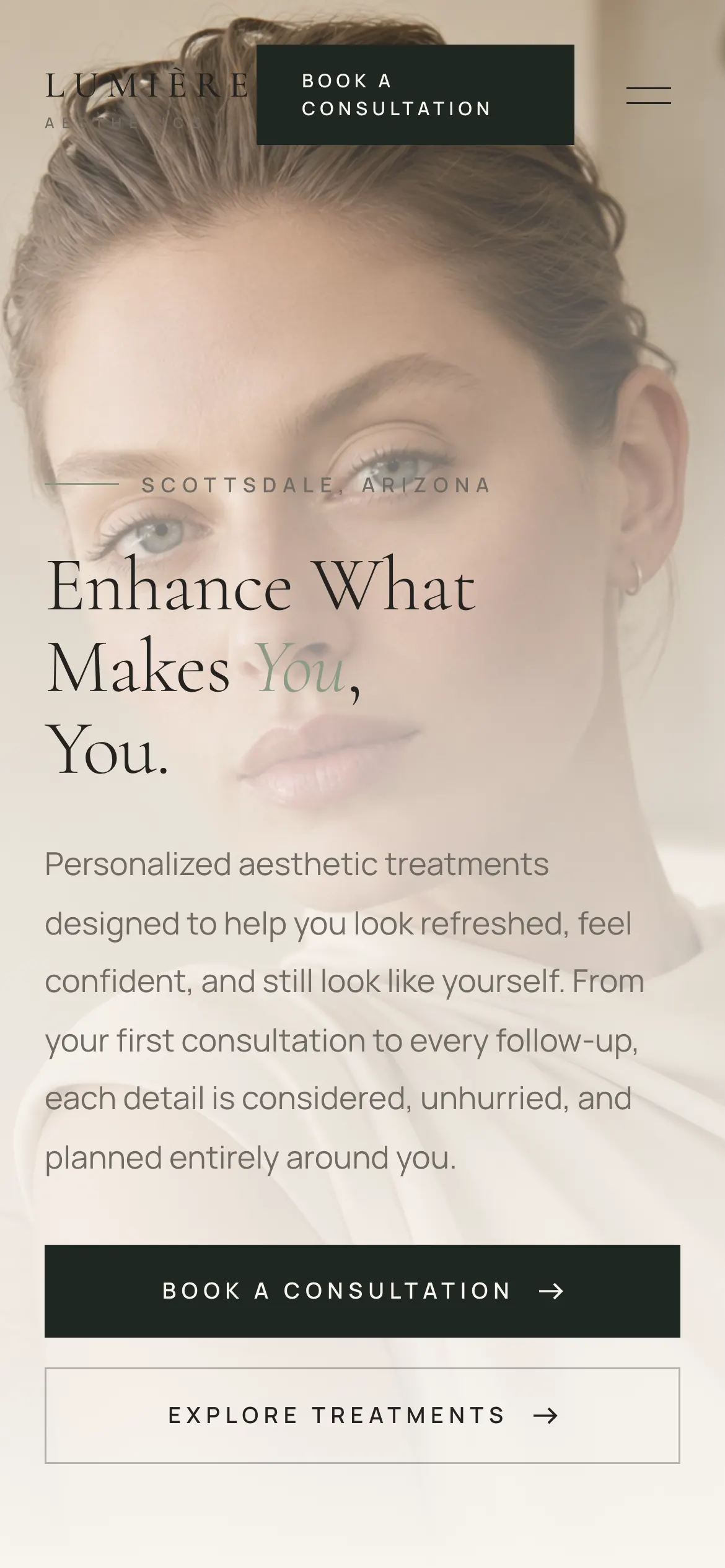
Serif display type set against a warm portrait, with the whole proposition in four words and a paragraph that talks about how someone wants to feel rather than what the clinic sells.

  • Enhance what makes you, you
  • Two calls to action, neither of them urgent
  • Location set as a quiet eyebrow above the headline
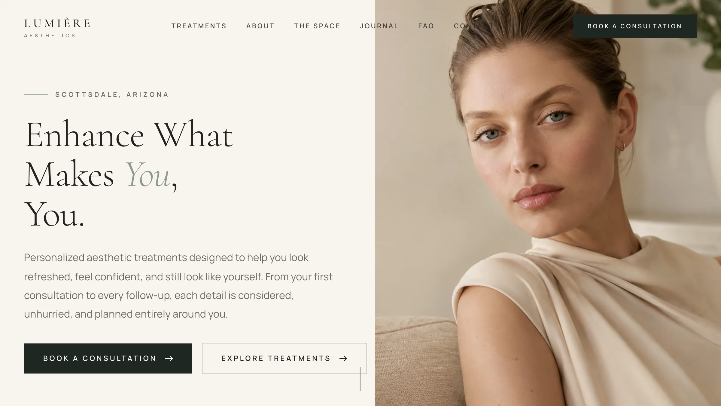
The Lumière hero with serif display type over a warm portrait

02 · Treatments

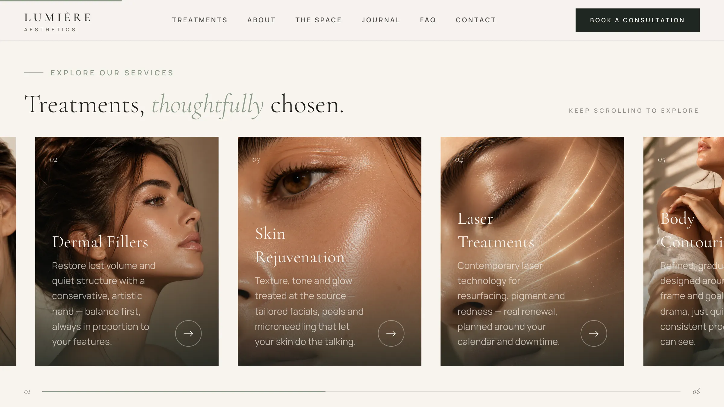
Six treatments that move as you read

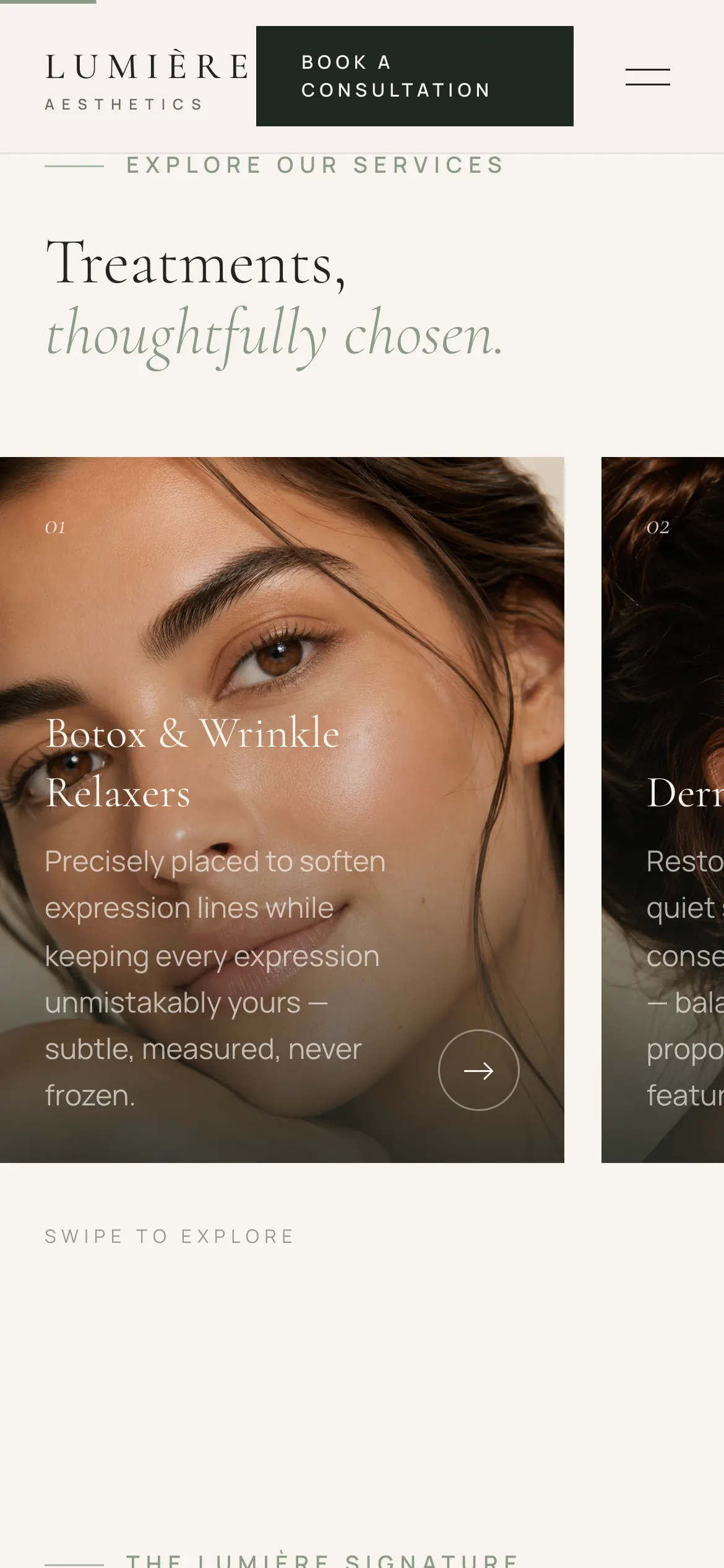
The treatments section pins while six cards travel sideways through the frame, driven by vertical scroll. Each one carries its own photograph and a sentence that describes the result rather than the procedure.

  • Vertical scroll drives horizontal movement
  • Botox through to wellness and IV therapy
  • Copy written about outcomes, not technique
The treatment carousel part-way through, with four cards visible

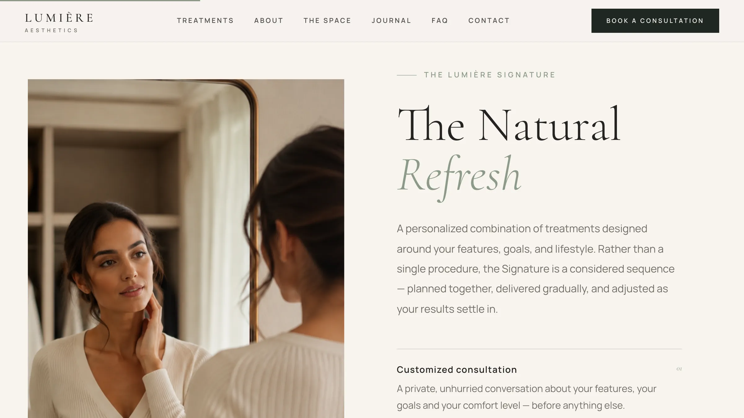
03 · The Signature

A plan, sequenced, not a package

The clinic's flagship offer is presented as four stages — consultation, written plan, conservative delivery, scheduled follow-up — which quietly makes the point that it is not a one-visit purchase.

  • Four stages, numbered and ordered
  • Explicitly not a one-size package
  • Follow-up framed as part of the work
The Natural Refresh signature section with its four numbered stages

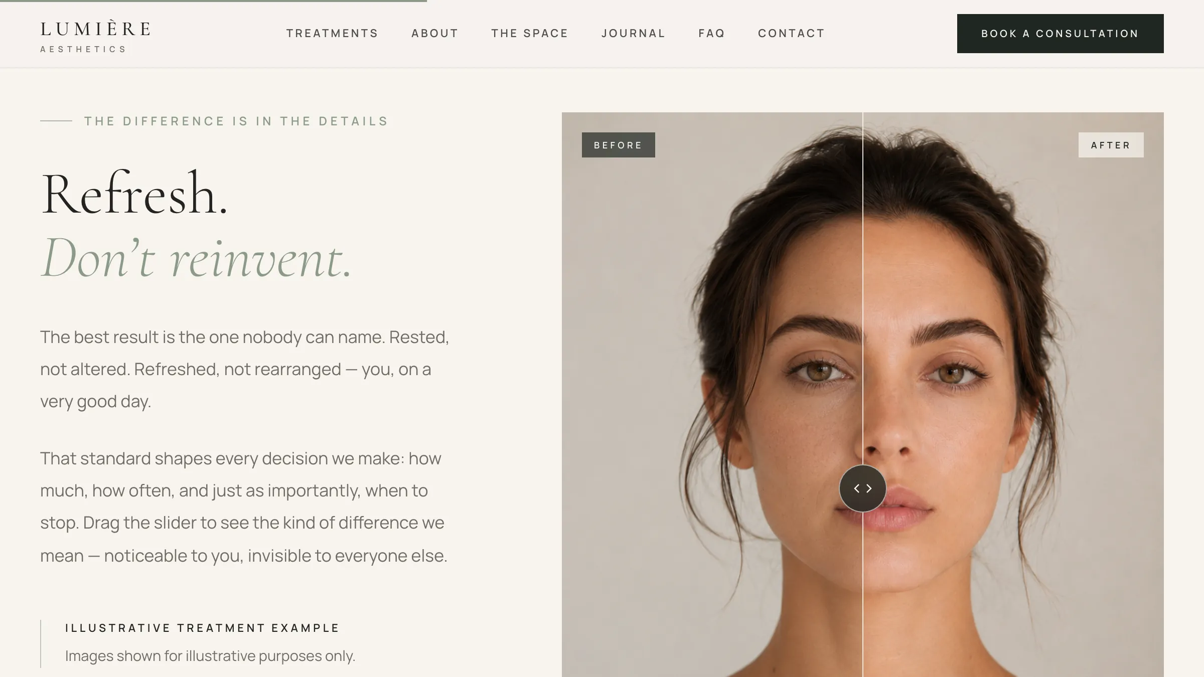
04 · Refresh, don't reinvent

A difference you find yourself

A drag-to-compare slider over a single portrait. Nothing is claimed in the copy beyond the standard the clinic holds itself to — the visitor drags the divider and decides what they think, which is considerably more persuasive than a pair of images.

  • Draggable divider with before and after labels
  • Marked as an illustrative example
  • Copy argues for restraint, not for the treatment
The before-and-after compare slider with the divider near the centre

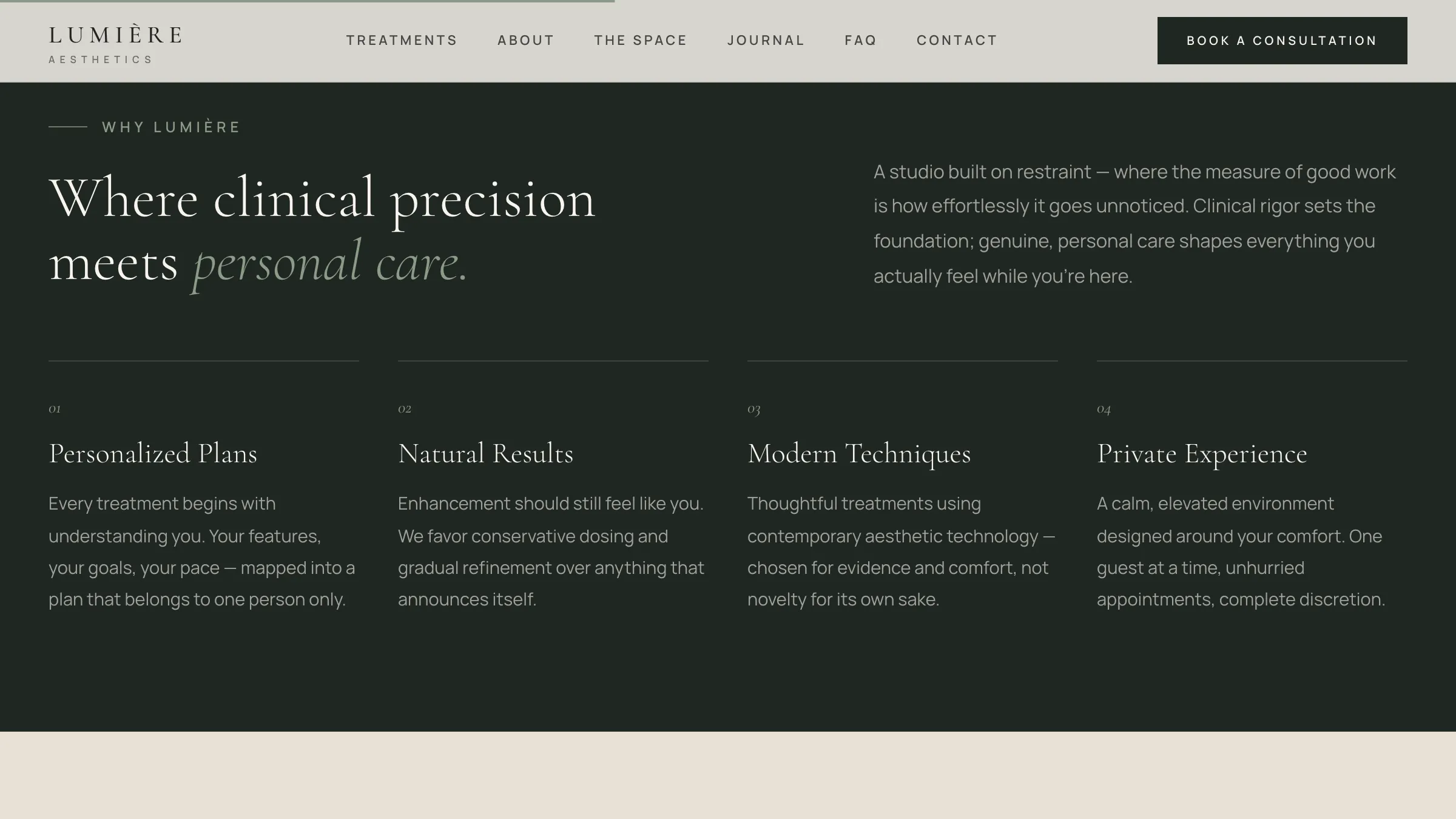
05 · Why Lumière

The one dark panel on the page

Four pillars on deep forest green, placed at the point where a visitor has stopped browsing and started deciding. The single tonal shift on the whole site marks it as the section that matters.

  • Personalised plans, natural results, modern technique, privacy
  • The only inverted panel in the document
  • Sits immediately before the proof and the practitioner
The why-Lumière panel in deep green with its four pillars

06 · The consultation request

A form that reads like a conversation

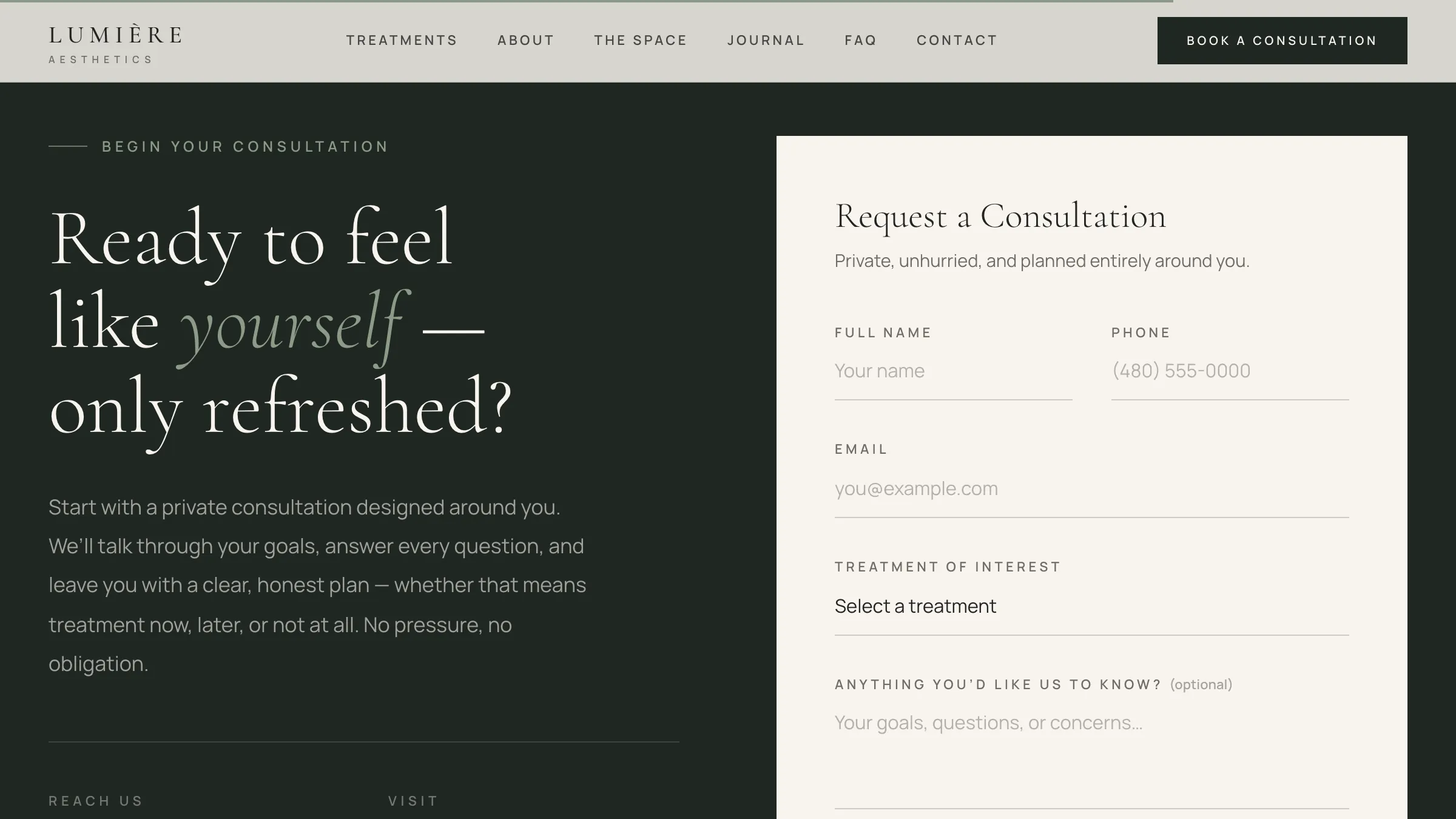
Full name, phone, email, a treatment of interest and an open field for anything else. The heading asks whether someone is ready to feel like themselves again, and the copy promises an honest plan including whether the answer is to do nothing.

  • Five fields, most of them optional
  • Treatment of interest as a select, not a quiz
  • Explicitly no-obligation, no-pressure framing
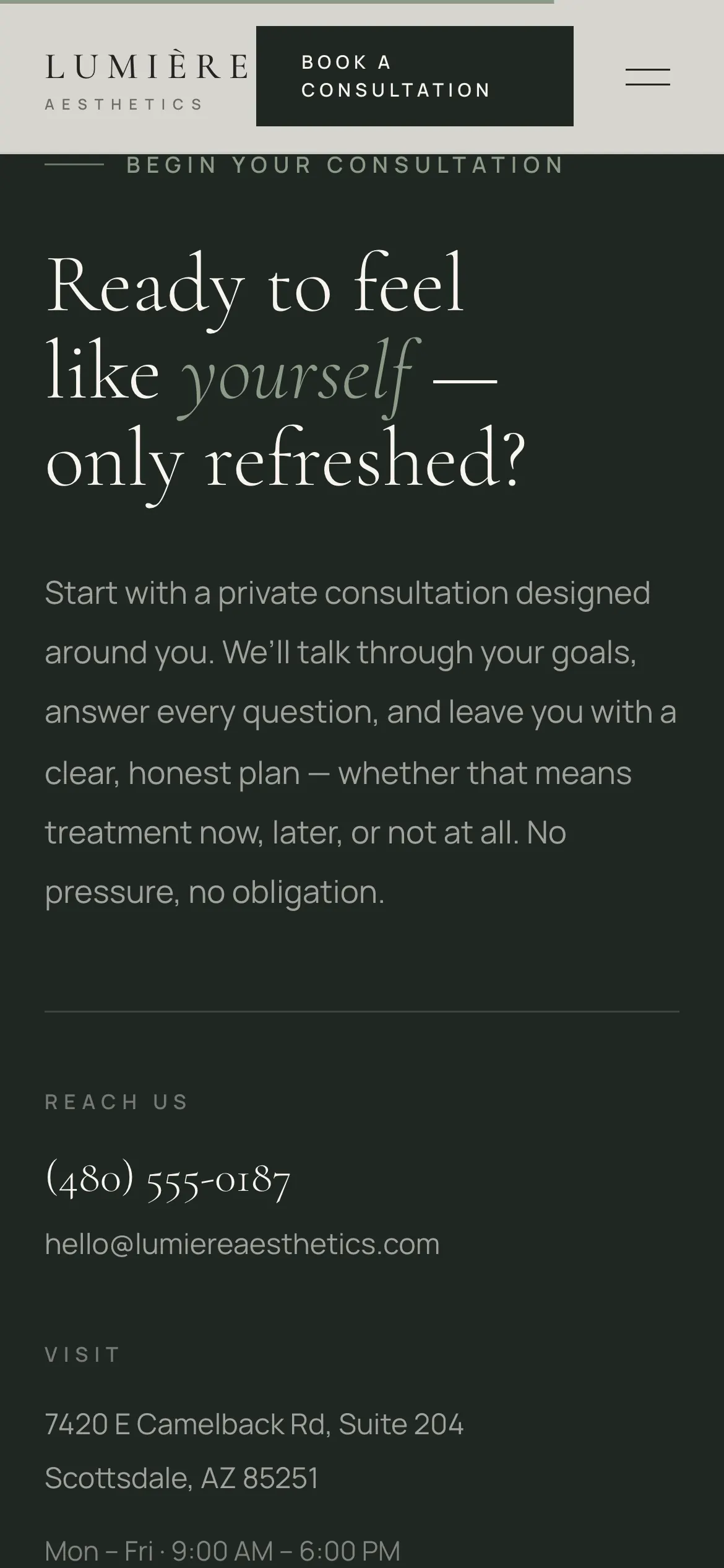
The consultation request form beside its invitation copy

In motion


The full tour is playing at the top of the page; these are the parts worth slowing down for. They play on their own, one after another, or pick one from the list.

Walkthroughs01 / 02

Mobile


The carousel, the compare slider and the form are all built for a thumb first, since this is the kind of site people open in bed at eleven at night.

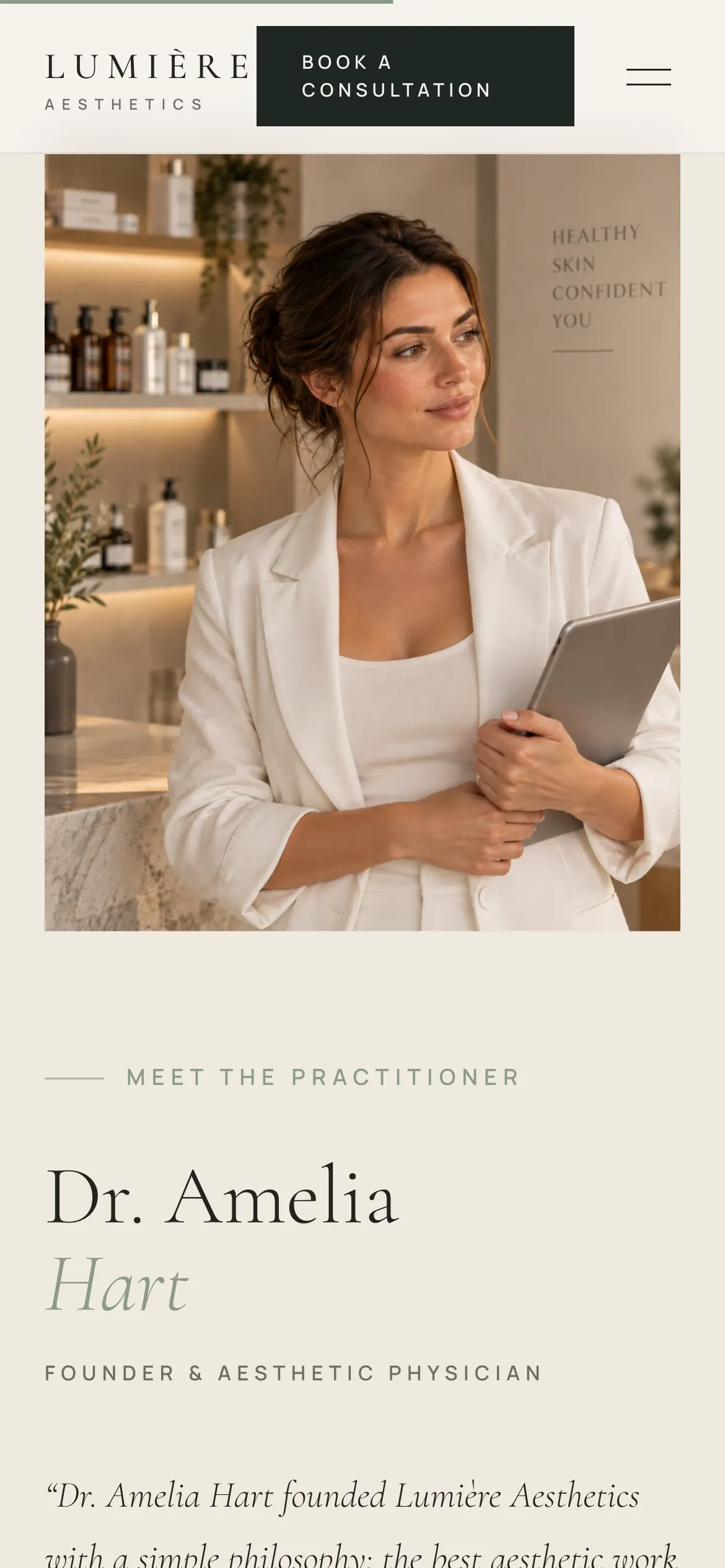
The hero on a phone with the portrait below the headline
The treatment carousel as a single-column scroll
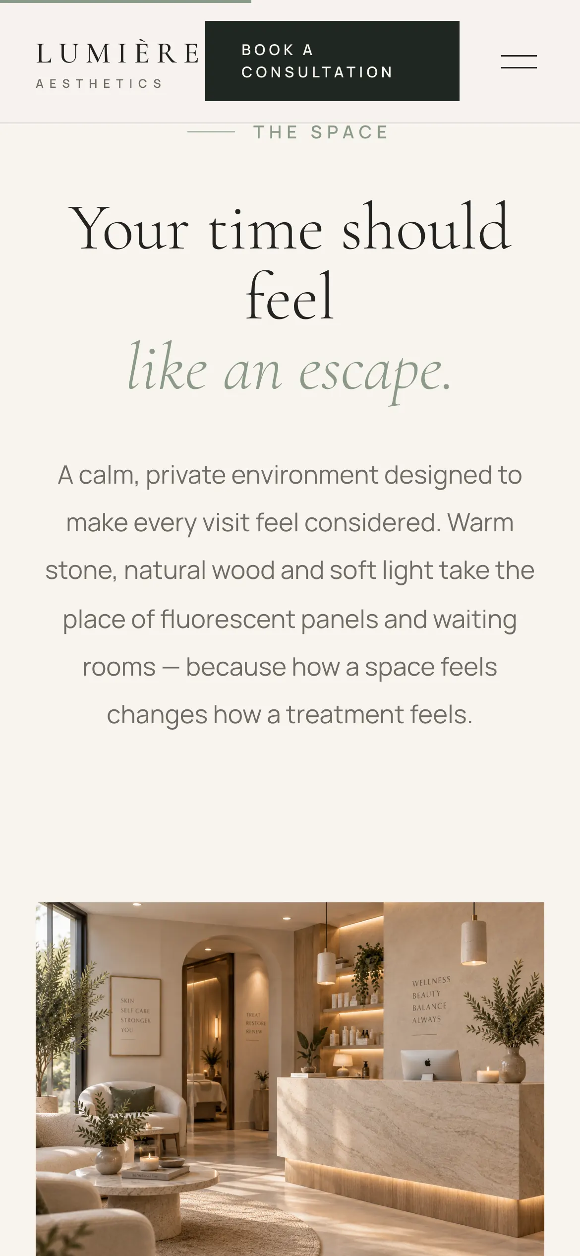
The studio collage restacked for a phone
The practitioner profile on a phone
The consultation request form on a phone

How it fits together


The same restraint as Vanta, turned warm — and the choices that made the difference.

01

Same brief, opposite temperature

Lumière exists because Vanta answered the question one way. Building the warm version of the same discipline was the point — it is the clearest way to show that restraint is a method, not a colour palette.

02

Serif for a clinical subject

A serif display face does most of the work of making injectables feel unhurried. Pair it with a neutral sans for body copy and the page reads as considered rather than medical.

03

Scroll drives the carousel

Horizontal scrollers get missed on desktop and fought with on mobile. Pinning the section and moving the cards with vertical scroll means the whole set is seen without anyone having to discover a gesture.

04

Let them drag it

A side-by-side before-and-after is a claim. A slider the visitor moves themselves is an experience, and it fits a clinic whose whole argument is that the best result is the one nobody can name.

05

One dark panel, placed deliberately

The single inverted section lands where browsing turns into deciding. Using the tonal shift once makes it function as punctuation; using it three times would have made it a pattern.

06

Say when the answer is no

The approach copy says some of the best advice is not yet, or not at all. For a category built on upselling, a clinic willing to say that in writing is the most credible thing on the page.

Keep exploring


A few more things I've built and shipped, picked at random each visit.

Next step

Need a site
like Lumière Aesthetics?