01
Warm, not loud
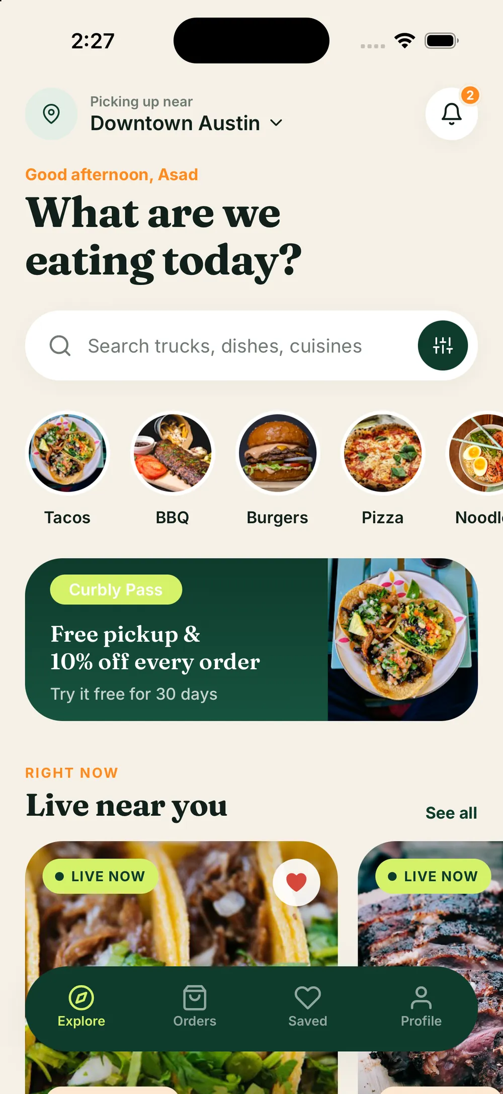
A cream canvas, deep forest green and a single citrus accent give the category a more premium feel than the usual dark map with neon pins.
02
The map is a card
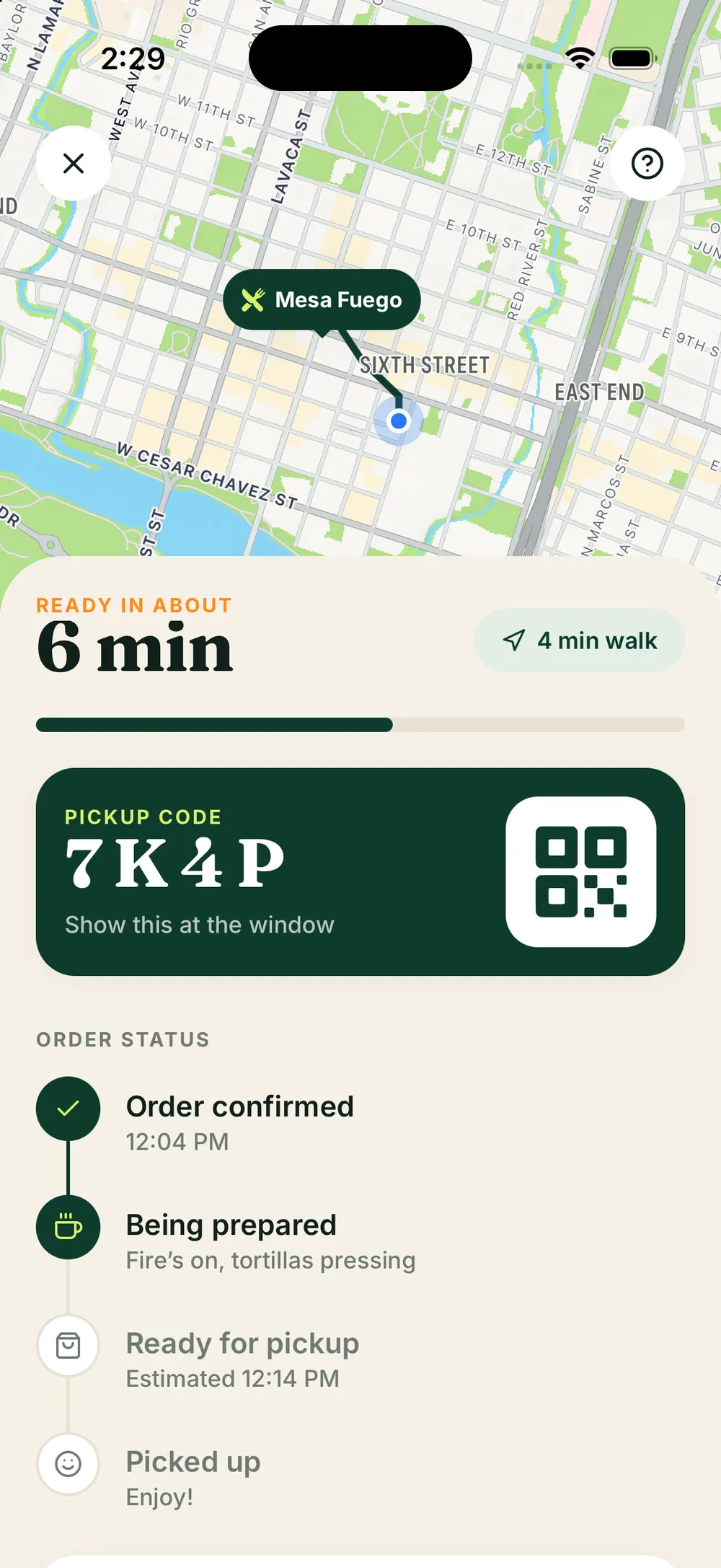
Most people want to know what is good, not where the pins are. Discovery leads with photography and ETAs, and the map expands when you ask for it.
03
Pickup, not payment at the window
Orders are paid in the app and collected with a code, so the truck's window stays fast and nobody fumbles with a card in the rain.
04
One app, two modes
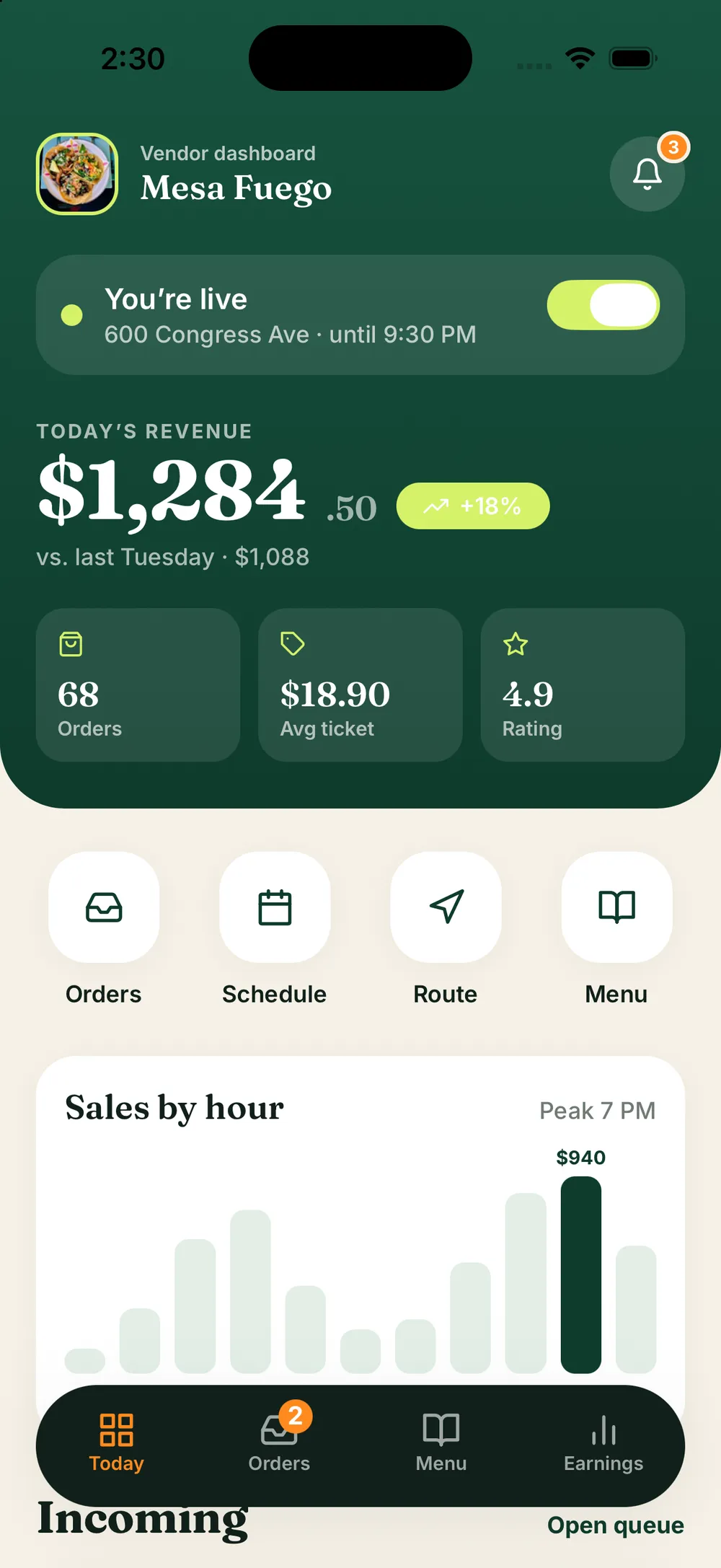
Owners are customers too. A single switch moves between the two experiences, which keeps the codebase and the design system shared.
05
Built for thumbs
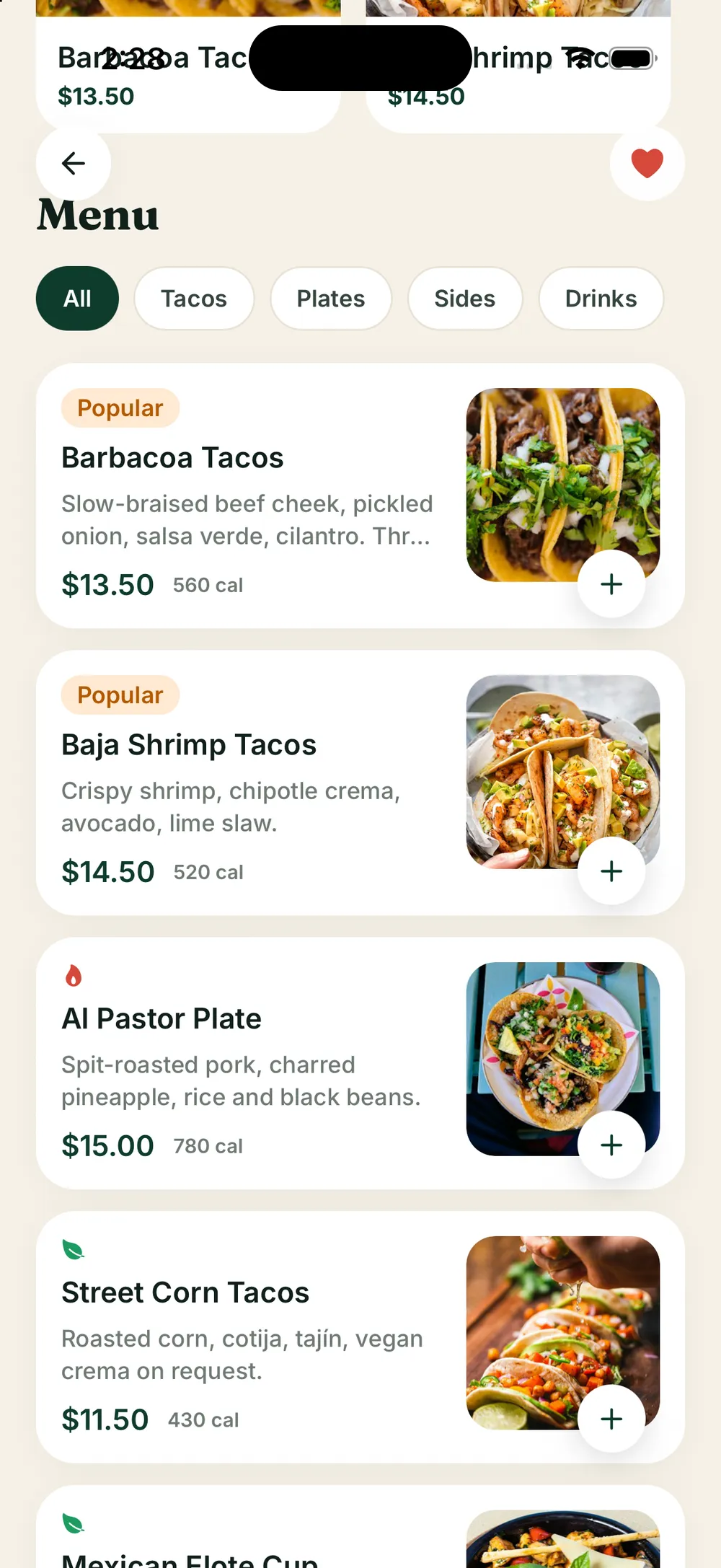
A floating tab bar, big tap targets and bottom sheets for secondary actions keep every common action within reach of one hand.
06
Sample data that reads as real
Ten trucks, forty-five dishes, reviews, orders and payouts make every screen feel lived-in, so the design is judged on its merits and not on empty states.