01
No accent colour at all
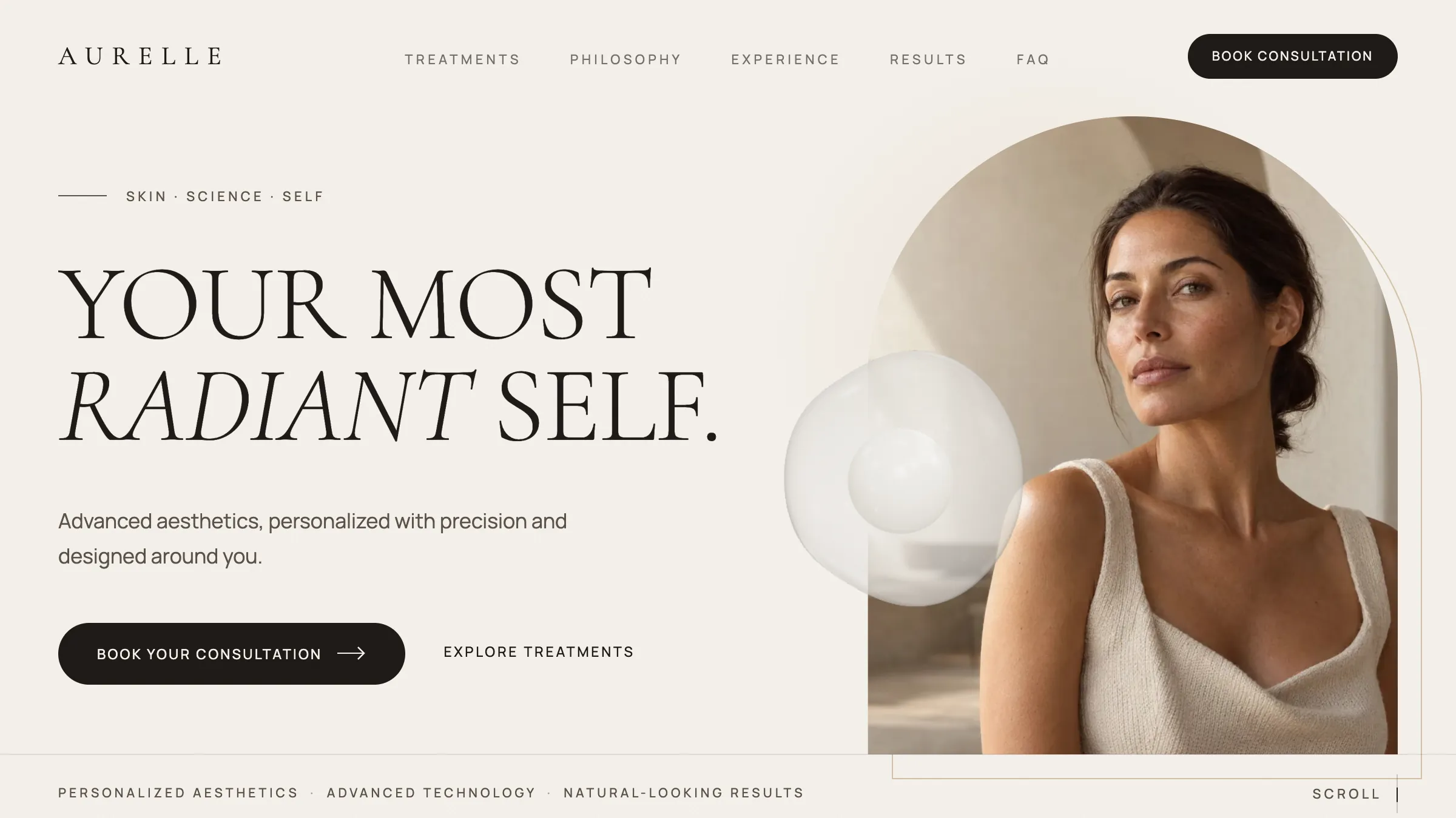
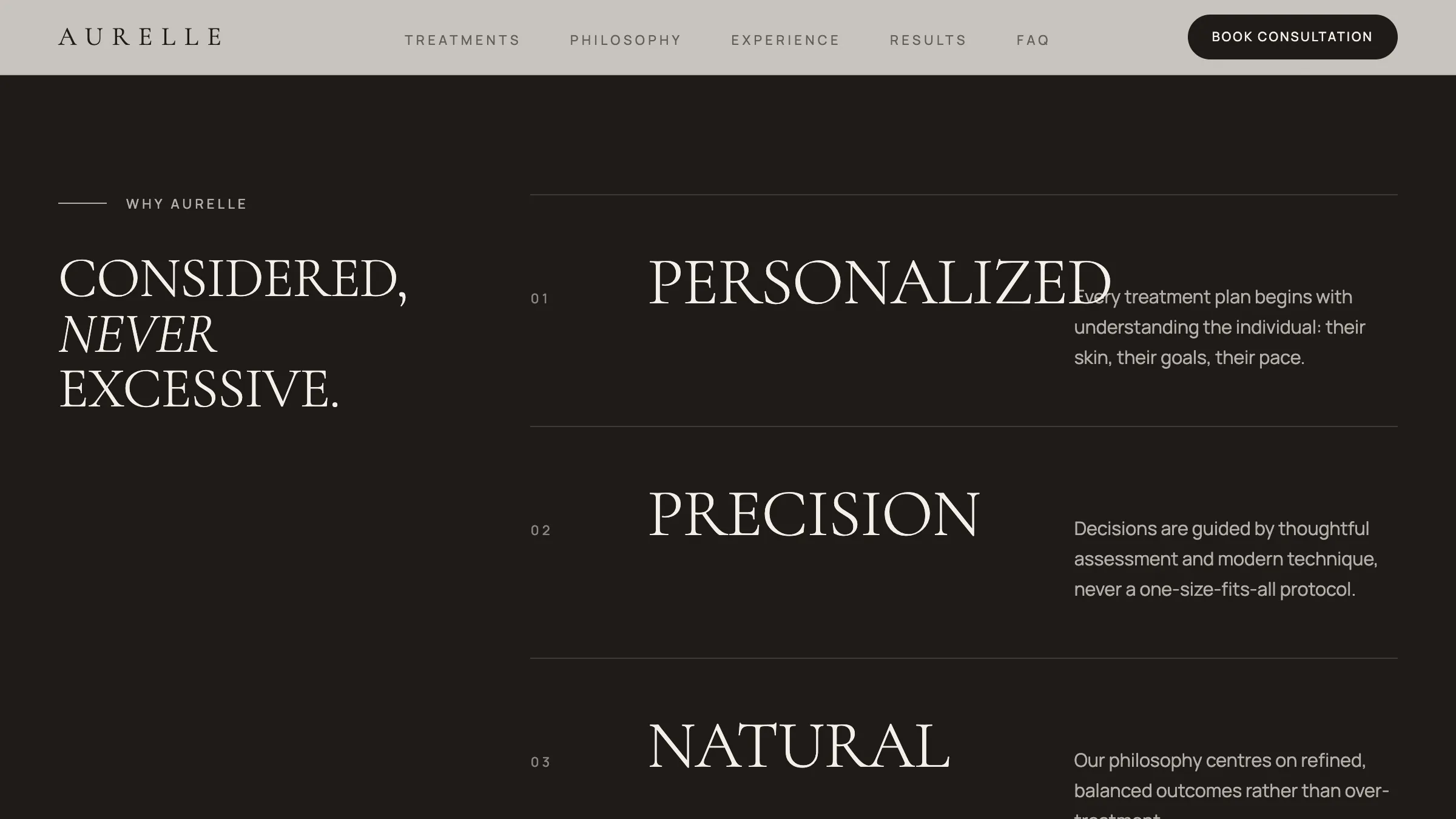
Vanta spends gold four times; Lumière has one green panel. Aurelle has neither. The display serif and its italic carry every piece of emphasis, and the four inverted sections do the rest. Take the accent away and the typography has to be right, which is the point.
02
A duration on every treatment
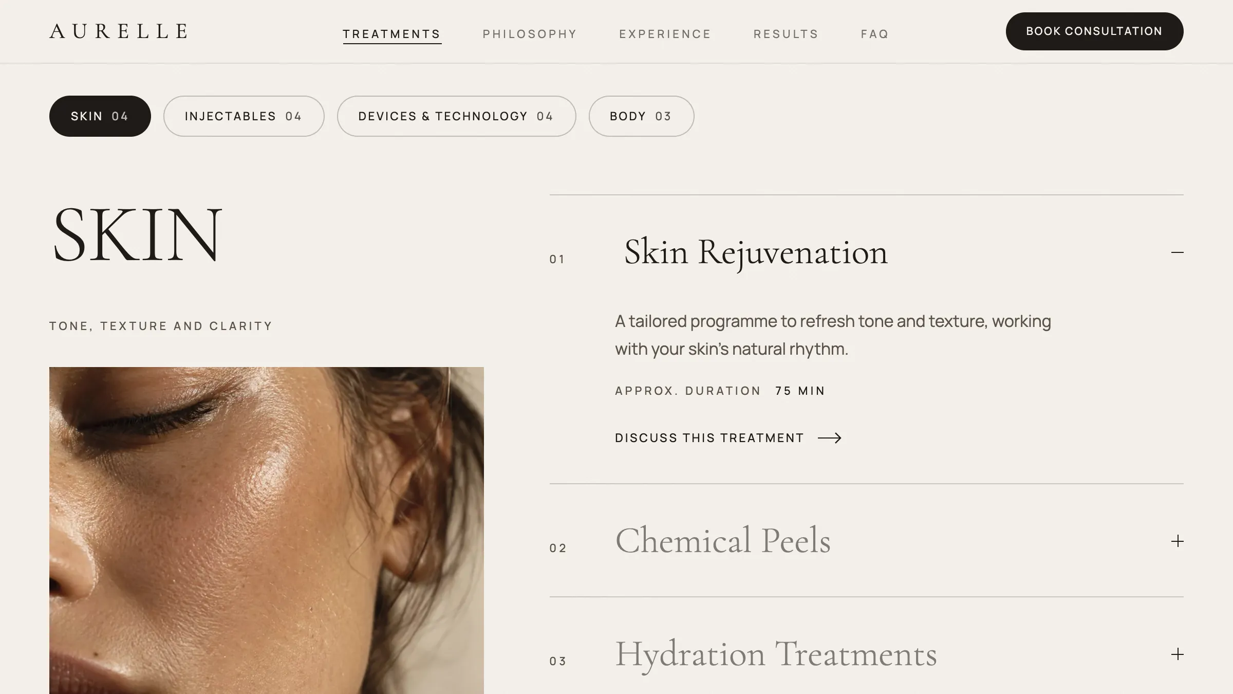
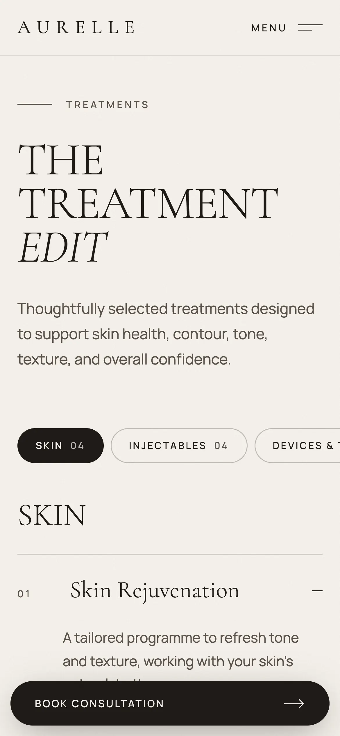
Fifteen treatments, fifteen approximate durations. It costs a line each and it answers the question sitting behind a lot of hesitation — how much of my day is this — without anyone having to ask it.
03
One source of truth for the treatment list
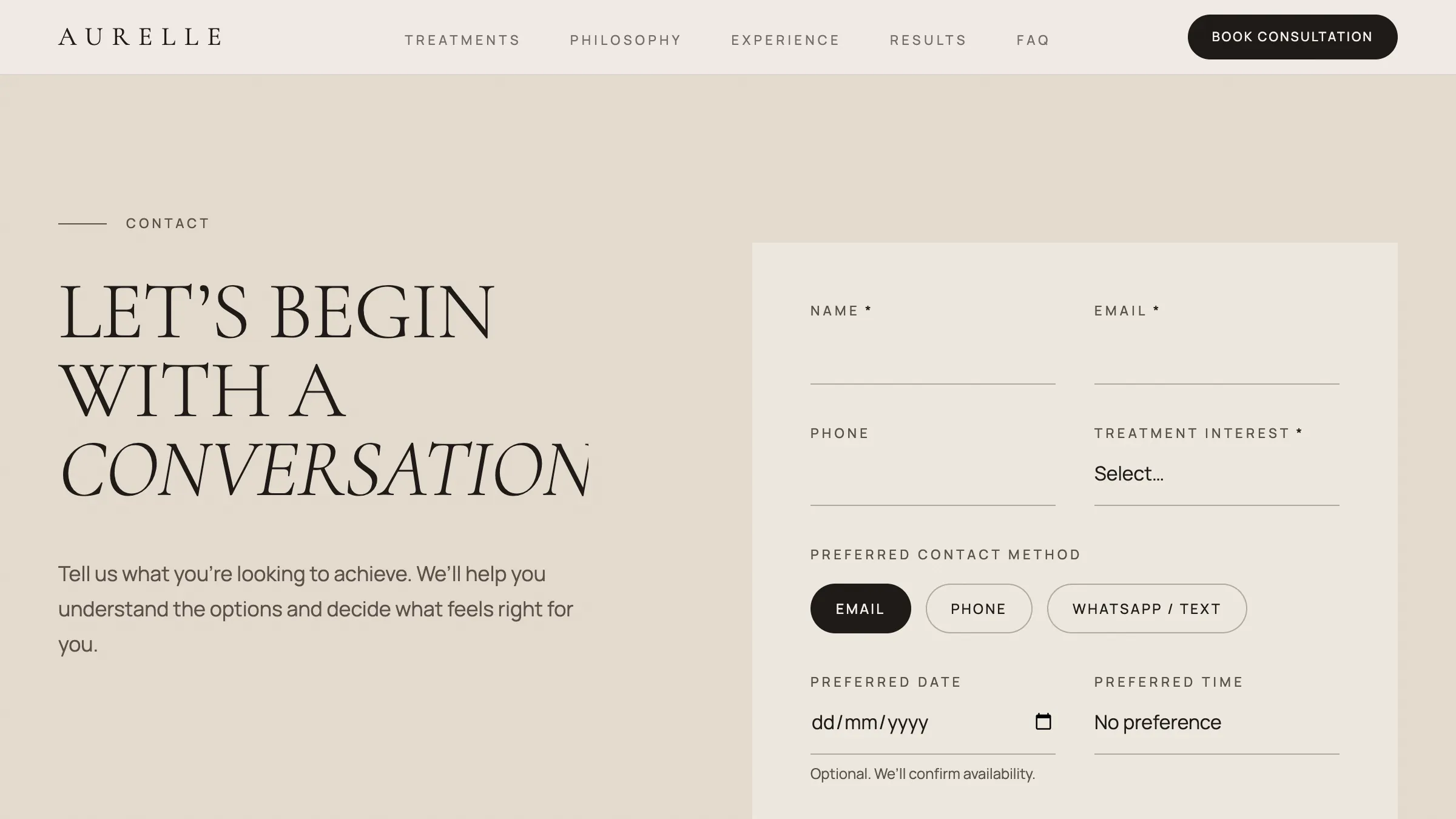
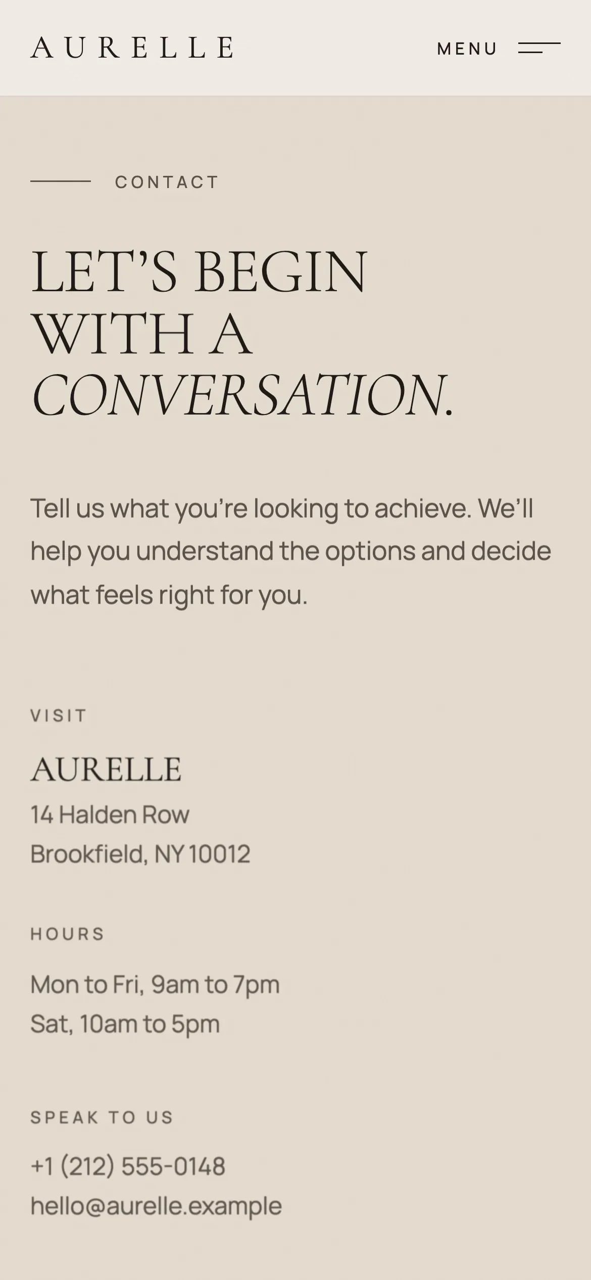
The enquiry form's interest list is the same fifteen treatments as the edit, plus an explicit not-sure-yet. Nobody has to translate between what they read and what they pick, and there is no second list to fall out of date.
04
The people are named
Three practitioners with their roles and qualifications, rather than a stock line about our team. For a trust purchase this is the highest-value section on the page, which is why it gets real portraits and real space.
05
Nine FAQs is not too many
Every one of them is a question a clinic actually fields by phone — what happens on a first visit, how to prepare, whether treatments combine. Answering them on the page costs a scroll and saves the visitor the call they were never going to make.
06
Honest about what the images are
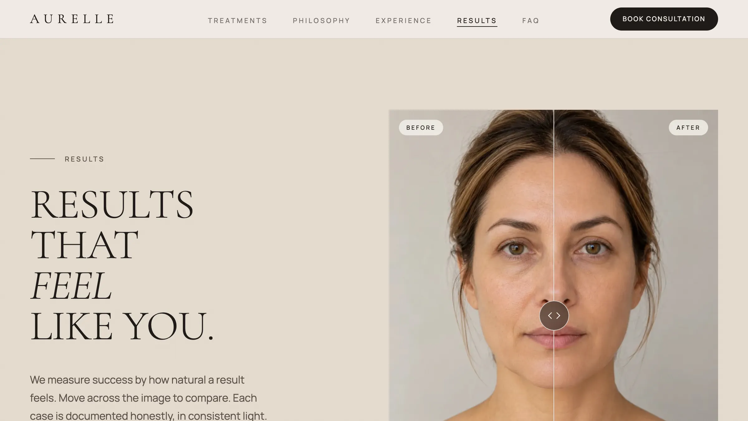
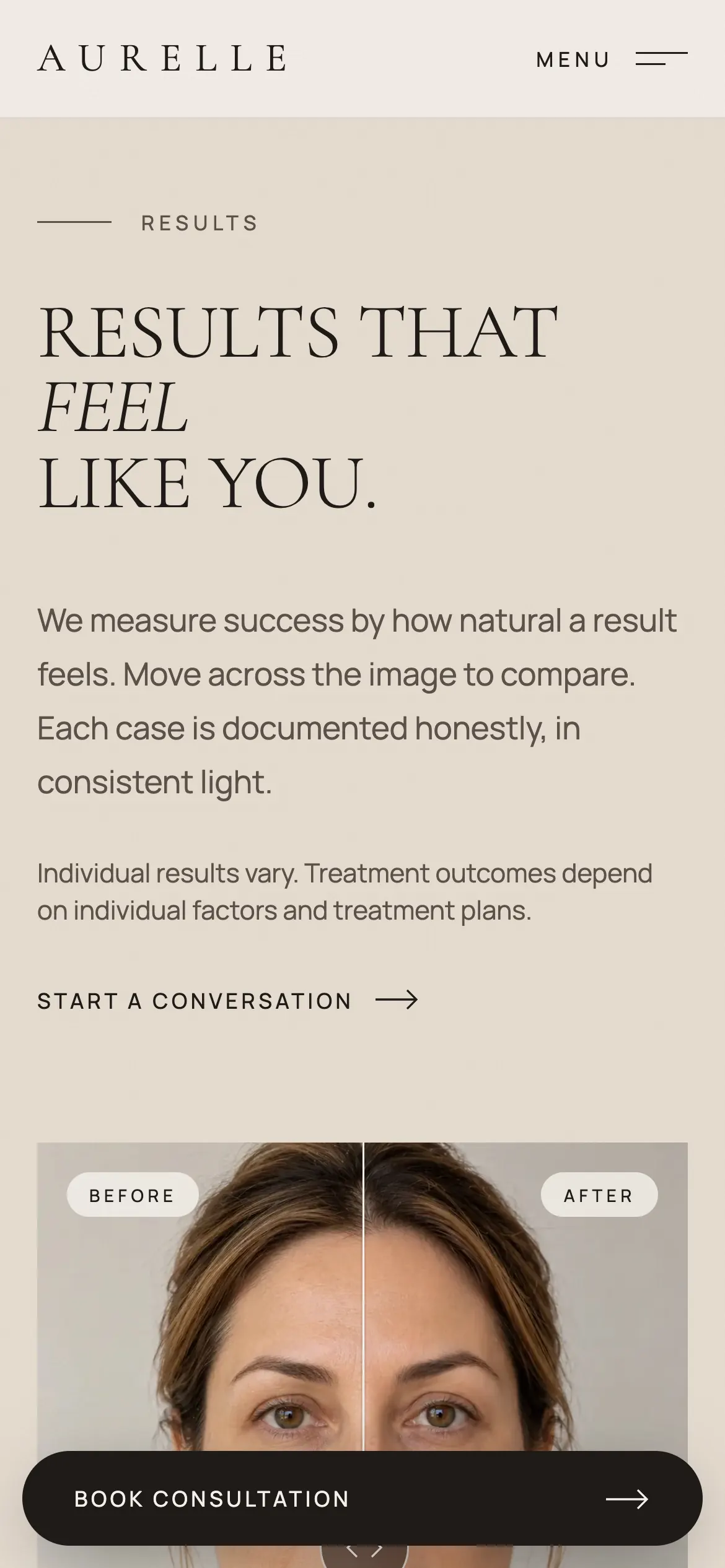
The comparisons state they were documented in consistent light, and the individual-results notice sits next to the picture rather than in the footer. A clinic site that implies results it cannot evidence is a liability, and saying so plainly costs nothing.